Following the whitewashing Material Theme-ifying of Gmail for the Web,
Google will be applying the same design scheme to its Gmail mobile
apps. In addition to going overboard with the buckets of white paint,
the new Gmail app will make it easier to view attached photos without
having to scroll through the conversation. It’ll also be easier to
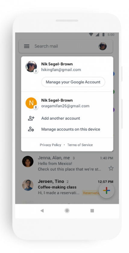
switch between work and personal accounts in the mobile apps, and
warnings of suspicious emails will be more glaring. Google’s blog post
said the following about the facelift:
As part of the new design, you can quickly view attachments—like photos—without opening or scrolling through the conversation. It’s also easier to switch between personal and work accounts, so you can access all of your emails without breaking a sweat. And just like on the web, you’ll get big, red warnings to alert you when something looks phish-y.The gallery of screenshots from Google’s blog below shows what the new design will look like.
Source: Google
Gmail for Android is getting a Material Theme redesign


No comments:
Post a Comment